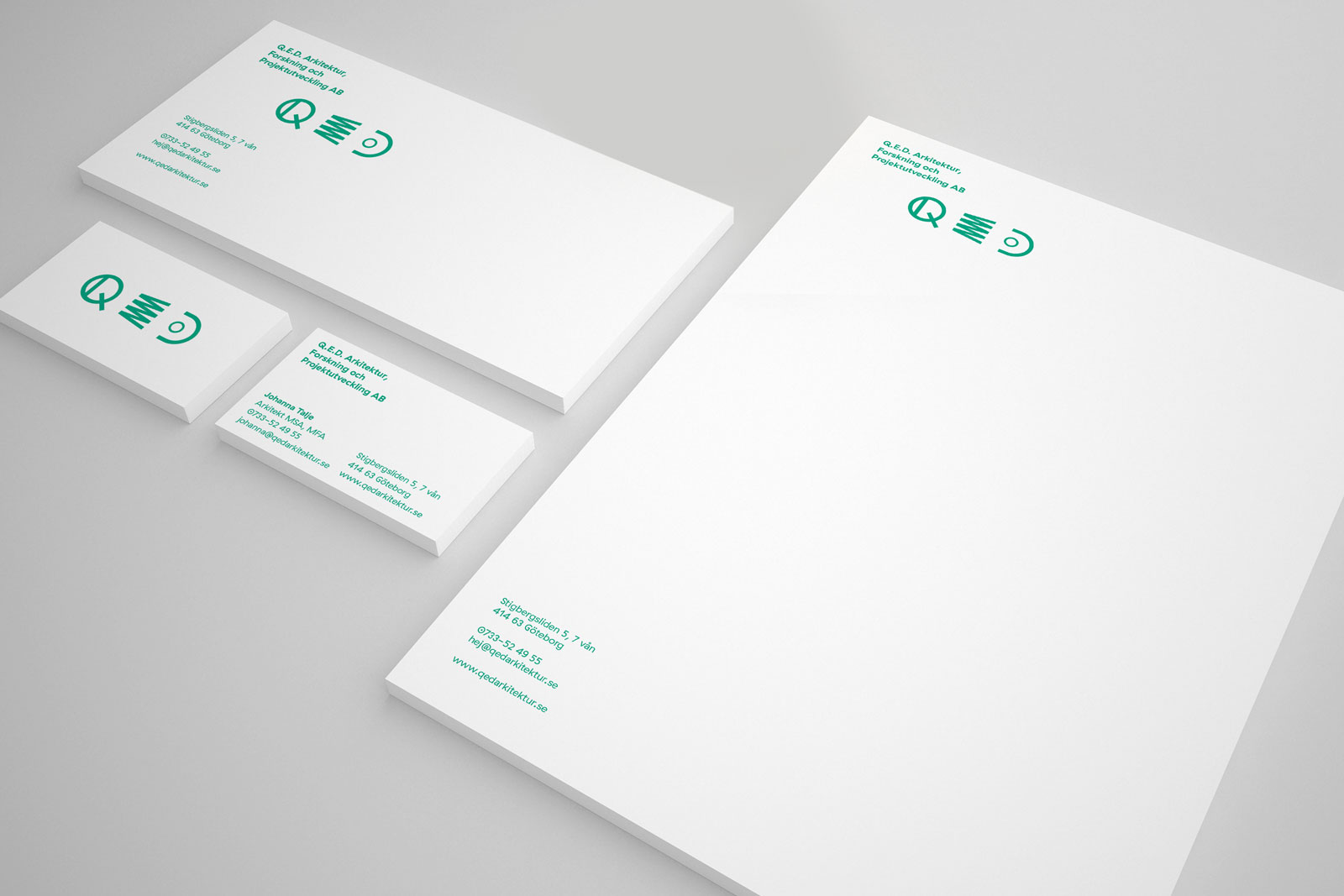
Client
Q.E.D. Arkitektur (Gothenburg, SE)
Year
2016
Scope
- Visual identity
- Graphic design
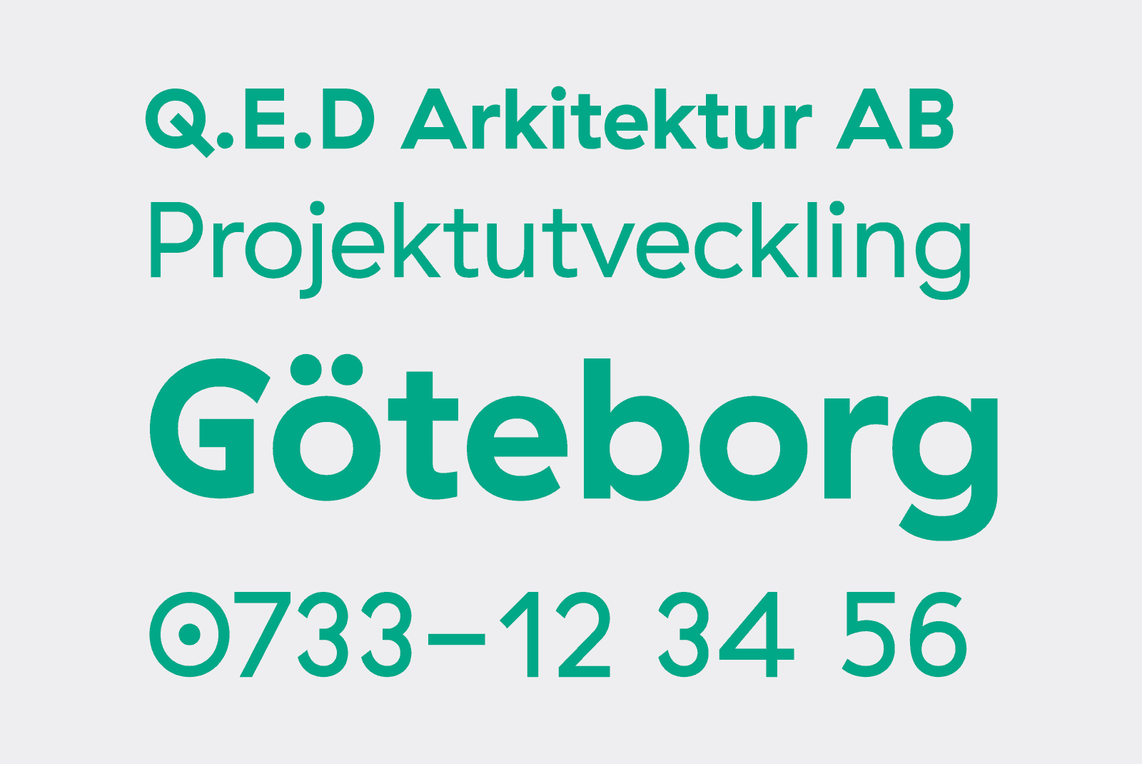
Q.E.D. Arkitektur is a recently established architectural firm in Gothenburg. We created a playful mark based on a collection of mathematical symbols, referring back to the meaning of Q.E.D. Rather than one static logotype, we settled on 9 symbols, the shapes of which approximate the letters Q, E, and D. Using these symbols, it's possible to create a total of 27 variations of the logotype.